
I am reflecting on Learning and Knowledge Analytics Week 4: Tools for, and examples of, analytics. I have fallen a bit behind in the course, but hope to still complete the last two weeks.
Although data analytics seem to have penetrated the world of business quite dramatically, they do not seem to have had as much of an impact in education. Our course conveners suggest that “analytics tools adopt or extend functionality of innovations in emerging technologies“. So perhaps learning technologies are trailing other innovative sectors already using data in predictive and intelligent ways. Interestingly enough, for most institutions one of the largest sources of data is likely to be the LMS, a system that is often critiqued for simply replicating classroom activity or automating the past (Bush & Mott, 2009).
My colleague Andrew Deacon and I set out to explore how we could start to use some of the data we had available to us predominantly through our LMS and student records to create some visualizations which might translate to intelligent analytics. A few things to note:
- We are at a residential university
- The university has had excellent uptake in the institutional LMS
- We were in a privileged position of having access to lots of data from various sources
Below we share some of the visualizations we have created from the data and identify where it was possible to identify patterns in the data.
First year registrations among the faculties
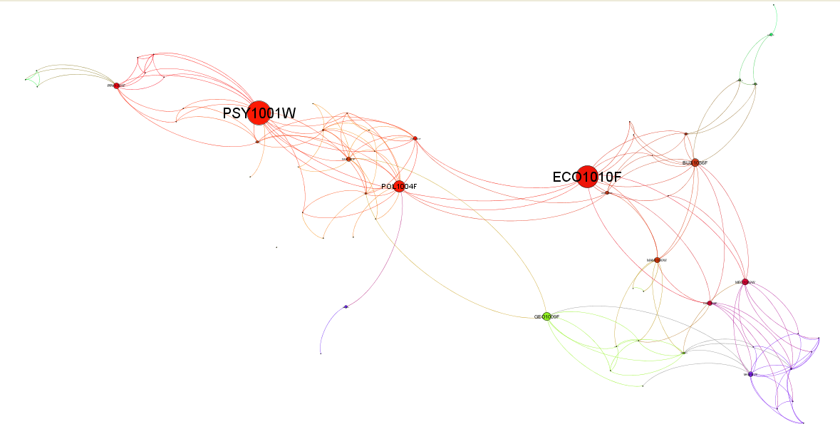
Course diversity plotted using Gephi
A macro level view of courses throughout the university. Rather than just visualize the largest courses in terms of numbers of students, in this diagram we examined which courses are the most diverse in terms of students registered. We did this by examining the other courses taken by the students registered for the same course. The degree of each node (number of edges) is an indicator of this diversity. To make the visualization simple we hide edges representing very low numbers of students (less than 20 doing the same pair of courses) and higher level courses.
First year courses which contain a wider array of students taking more diverse groups of courses are represented by the larger circles. This visual shows that the Psychology and Economics courses service the most diverse study directions. The red, yellow and pink nodes and edges roughly identify the humanities, social science and commerce courses which clearly have more diverse course combinations in their degree programmes.
LMS events by week over a semester
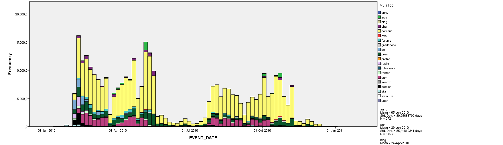
On a course level view we examined the LMS event logs which tend to get large and complex. Our logs contain events like, ‘content.read’ which is clearly not an indicator of whether the content was actually read by the student, and is simply a measure of the request for the document. Despite some events being misleading and ambiguous, we do see some patterns emerge as one might expect.
This chart shows user generated event frequencies over a year for a year long course using LMS logs. Its clearly evident that most activity happens within the four terms, as one would expect. One can clearly identify the semester breaks, where students are quite inactive, as well as the mid year break. Significant colours are Yellow & Dark Green = site visit & content accessed; Pink = quiz assessments; Purple = chats
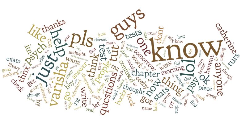
Chat room dialogue word cloud
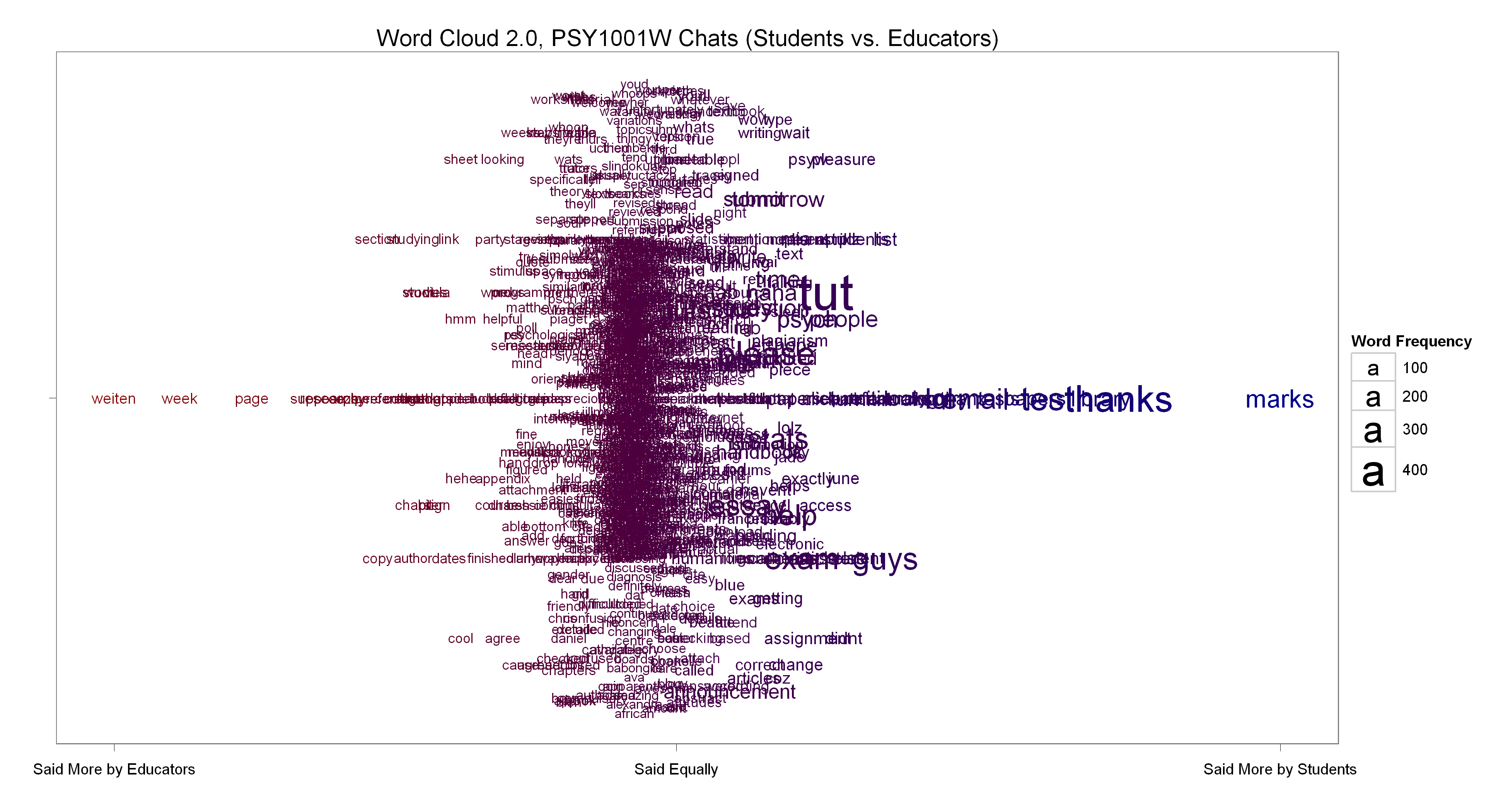
A smarter word cloud of all words used in chats by both the educators and students, generated with R using Drew Conway’s code and ideas. The only change we made was to weight the educator word frequencies to more or less match the student word frequencies. Words used more educators are towards the left on the X-axis, while those used more by students are towards the right. The majority of words gave roughly equal frequencies and are in the middle. The educators made reference to the textbook’s author (Weiten) much more frequently than the students who were asking disproportionately more about marks.
Chat room dialogue over the entire semester
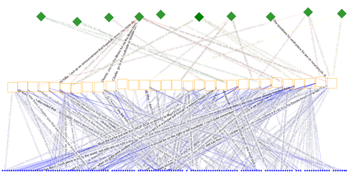
This visual shows students (blue dots) interacting with the chat room during different weeks (orange squares) throughout the semester and where lecturers, tutors, and librarians (green diamonds) interacted with the student chats. The lines are represented by the strings of text which were uttered in the chat room.
Alternative chat room dialogue visual
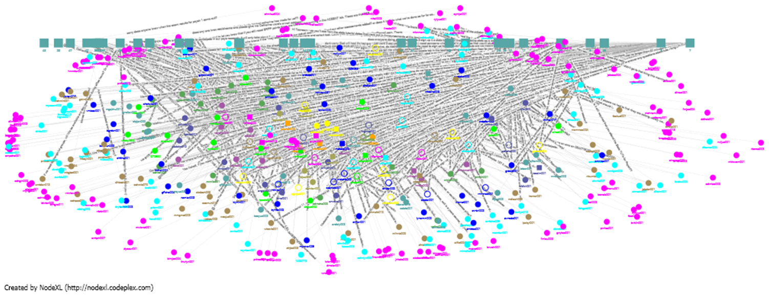
Looking at the number of chat contributions by weeks, we see some patterning as most students only post in one week (pink), blues and greens indicate moderate chatting, with the yellow and gold chatting in almost every week. The squares indicate the weeks.
Word cloud of chat dialogue from students who subsequently dropped a course
This word cloud is generated by analyzing the text of a chat room dialogue. The larger words are mentioned most frequently. This chat dialogue is limited only to students who dropped the course. Could we have anticipated their cries for help?
Resources accessed during a course
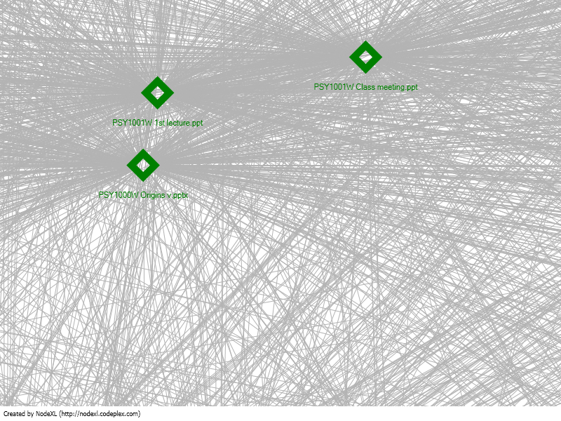
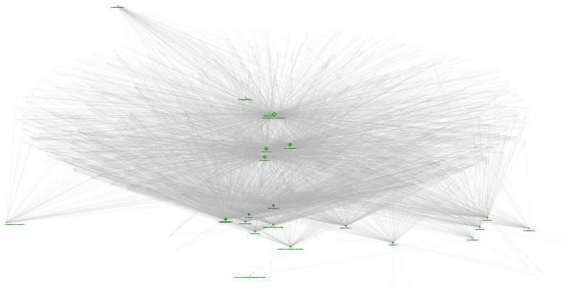
Resources accessed during a course visualized with NodeXL
This diagram explores how resources are accessed during the semester. Green diamonds are resources available via the LMS accessed by students. Endpoints are students. Presumably students and documents accessed the most are central; students and documents accessed the least are on the periphery.
Discussing gender in a forum

Another smart word cloud this time from a Moodle discussion forum. The discussion topic “Are women more polite than men?” The forum data was captured using SNAPP. The discussion was on a single topic, with the interest being whether male and female students would respond differently. We again used Drew Conway’s R code to contrast the two groups and calculate relative frequencies. We then generated a graph of these words used by individual students.

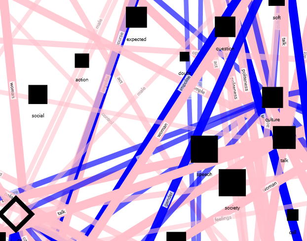
In the NodeXL visualization, the words and edges are blue if they were used more frequently by men, with pink for women. Only edges of frequently used words are shown based on the data from the smarter word cloud above.
Discussion
We have found that most of the work required in creating these visualizations is in organizing, cleansing and structuring the data. Again this has to do with accessing and unifying data from the various silos institutions maintain, e.g. LMS, student records, enrolments. While projects like the Purdue Signals Project and UMBC’s “Check my Activity” tool automate the delivery of analytics to the end user, reports such as the ones above require quite a bit of work by the analyst. Another key difference between the aforementioned projects and these visualizations is the intended end user. We have taken the stance of what we imagine an educator may want to visualize in their course. I believe that much more could be gleaned from the data if we applied some qualitative analysis, for instance coding chat utterances or forum posts according to themes. This again requires more work by an analyst to define the coding.
References
Bush, M.D. & Mott, J.D. (2009) The Transformation of Learning with Technology: Learner – Centricity, Content and Tool Malleability, and Network Effects. Education Technology 2009-VOL 49
#LAK11