I should be working on my thesis right now.
Ok, now that I have gotten that out of the way. I wanted to share a small project I have been working on in visualizing my social network on Facebook. Your own personal social graph can quite easily be exported from Facebook using the Netvizz application. Once you have installed the app in Facebook and exported the graph you will get a text file which can be fed into a social network visualization tool such as Gephi. You might remember I was using Gephi for the learning and knowledge analytics course earlier this year.
After feeding my social graph into Gephi and following the techniques in this slideshare presentation by sociomantic labs [new link] I came up with the following visual of my network.
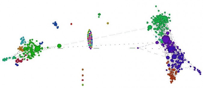
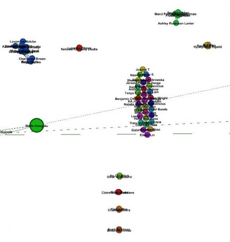
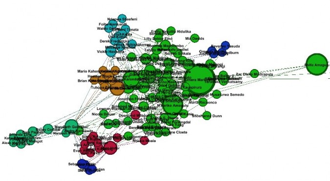
Upon closer inspection and investigating which nodes were who in my social network I discovered that this image is a pretty interesting view of my Facebook friends. I was quickly able to identify major clusters of people in my life grouped together and segmented by colour.
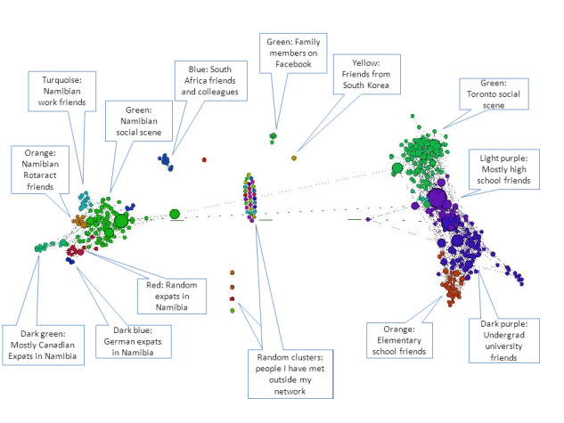
So the entire left side is basically people I have met and worked with in Namibia and South Africa. They are quite neatly organized together.
On the right side is my social network from Toronto and around Canada. I believe the larger circles represent people with lots of wall posts – but I am still investigating.
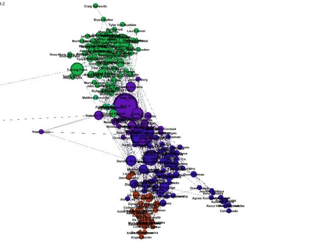
Those lost nodes in the middle are interesting as well. Contacts I have met who are not closely related to my larger social circle. Also my family appears as a cluster here as they are not linked to my social circle – probably a good thing!